The Most Beautiful Graphic Design Trends of 2018
-
laurenholliday89@gmail.com
- Design
- 480

One of the ways I got better at design was (and still is) by “copying” what I liked about other people’s sites and taking all of those various elements to create my own unique website.
The thing is, when you’re new to web design, you might not know where to look for inspiration at first and/or what is currently cool in the wide world of design.
In this post, I’ll walk you through some of my favorite 2017-18 design trends, but because trends go out as fast they came in, you should also follow the right blogs and influencers to stay up-to-date. Don’t worry, I’ll share resources too.
Gradients
If you would’ve asked me if gradients were cool last year, I would’ve said no. This year, that changed; gradients are making a comeback!
You can use gradients in your typography, like I did here for GoSkills:

I’ve used this UI kit to do something similar to the screenshot above.
And here’s another example of gradient typography.

And then there’s one of my favorite websites, which uses gradients as borders around its main content…

Inspiration:
Purchase Gradients:
Big, Bold Header Fonts

You can see the Google’s most popular fonts by going to fonts.google.com and filtering by “popularity.” Don’t necessarily use this as a design signal though.
Big, bold fonts are my usual go-to (I think they’re easiest to read), but I’ve been playing around with thinner fonts, like you see on MarvelApp, Intercom and Stripe.

A nice combo of bold headers and thinner body fonts are probably best. It makes for the best readability.
Bold Google Fonts (Usually good headers):
Thinner Google Fonts (Usually good for body):
Resources:
Flat Design

Flat design has been popular for a while now, and it looks like it’s here to stay. See examples of flat design by visiting any of these websites below:
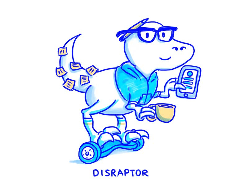
Modern Retro (Late 70s-90s)

Think throwback, but not super throwback.
Modern retro gets its inspiration from the late 70s-90s.
This style makes users feel nostalgic, which usually spurs a connection between the design and its users.
Characteristics include:
- Tech themes featuring old-school computers
- Music themes with turntables or tapes or boom boxes (remember those?)
- Clean abstract illustrations featuring people, but not faces
- Bright colored line art and squiggles
- Geometric shapes with thick strokes
- Flat elements, from shapes to lines to icons, modern retro does not use a lot of extras and is somewhat reminiscent of flat design
- Pixel-based illustrations that mirror early video games
- Neon style anything, from neon colors to elements that mimic neon lights
- Line-style user interface elements without adornments or a lot of color
- Simple animations that don’t move too fast and that almost seem to skip at times
- Plenty of custom typefaces, including bubble-style lettering, blocky slab serifs and typefaces that mimic popular video game, movie or television titles
- Rich color palettes with plenty of “happy” hues, such as golden yellows, oranges and reds
Inspiration:
Cool Patterns
You can find patterns by searching for “background patterns” or “memphis patterns” on Creative Market or Dribbble or by googling and searching Depositphotos.
Inspiration:

https://www.thebestdesigns.com/designs/circles-conference-2016

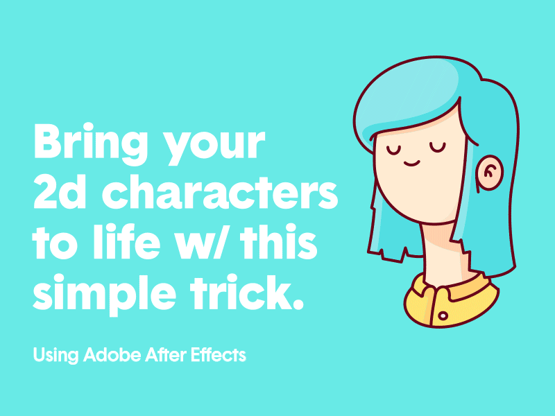
Illustrations
For those of us who aren’t illustrators, we can hack our way around this in one of two ways.
- We could download pre-made illustrations on websites like: DepositPhotos, Shutterstock or Creative Market. You just need to filter your search by “Illustrations.”
- You could download “vectors” from the above mentioned websites, and customize them via Sketch or Adobe Illustrator.
A note on icons: I’d pick one icon set for your website — to keep things consistent — IF you even need icons. Where do you find icons? I’ve used:
I’m sure you could find free icons too on somewhere like Dribbble and by googling.
GIFs
GIFs can be used as mini tutorials to guide users through your site, or you can use them just for fun.
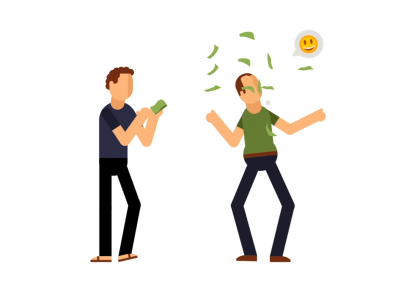
Make your own GIFs on gifs.com or download GIFs from giphy.com, or outsource it. It shouldn’t cost that much to get made, as long as it’s not complicated. The last GIF I had designed was $60.
Duotone
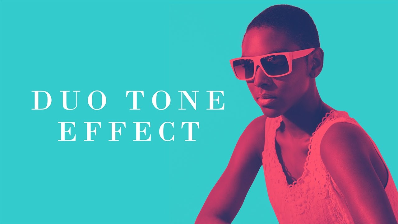
Duotones are great for background images.
I highly recommend this Photoshop Actions pack. It comes with a how-to video on making duotone images. It’s really simple.
Pay Attention
In a world that’s constantly evolving, it’s vital you notice the details in websites and apps you visit and designers you follow.
You’ll begin to recognize patterns, and then you can work those patterns into your work, designing your very own beautiful creations.
I’m sure I didn’t cover every 2018 design trend in this post, so here’s a link to an in-depth post on the latest design trends you can check out on Behance.
Leave a Reply